Available Languages:

Available Languages:
Dated: December 2020
Author: Alex Thomson
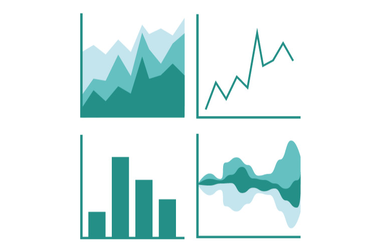
This guide is intended for anyone who wishes to develop their data visualisation and reporting skills. The advice presented will be applicable to a wide variety of situations and is not specific to certain topics. Additionally, we hope that users of all ability levels will be able to take this advice to mind in their future projects and their everyday interactions with data.
This resource first gives some general guidance on the presentation of data, before going into more specific detail on the use of tables, graphs and maps (an increasingly popular method of presenting data). It then provides advice on ensuring your visualisations are accessible, with consideration on the use of colour.
This guide is divided into information regarding tables, graphs and maps, and thus could be studied to provide comprehensive knowledge on the use of data visualisation, or users may easily review only the sections of interest to them.
The individual components of the trove are listed below. Click on one to download the file or go to the external url. You can download the full trove below as a .zip file.
Presentation_of_Tables_Graphs_and_Maps.pdf
2 MB
No collections available for this resource.
No related resources found.